N’Kenge Foundation Brand Identity
Amplifying BIPOC Stories Through Visual Excellence
When a foundation dedicated to magnifying BIPOC stories through the arts needed a cohesive brand identity, every design decision had to honor their mission while creating professional, versatile assets. This comprehensive branding project transformed the N’Kenge Foundation’s visual presence through strategic logo redesign, sophisticated typography hierarchy, and a carefully crafted color system that reflects both artistic excellence and community empowerment.
The Challenge
The N’Kenge Foundation came to the project with a clear mission: magnifying BIPOC stories through the arts to foster education, community healing, and empowerment. However, their existing visual identity lacked the cohesion and professional polish needed to match their ambitious goals and attract meaningful partnerships.
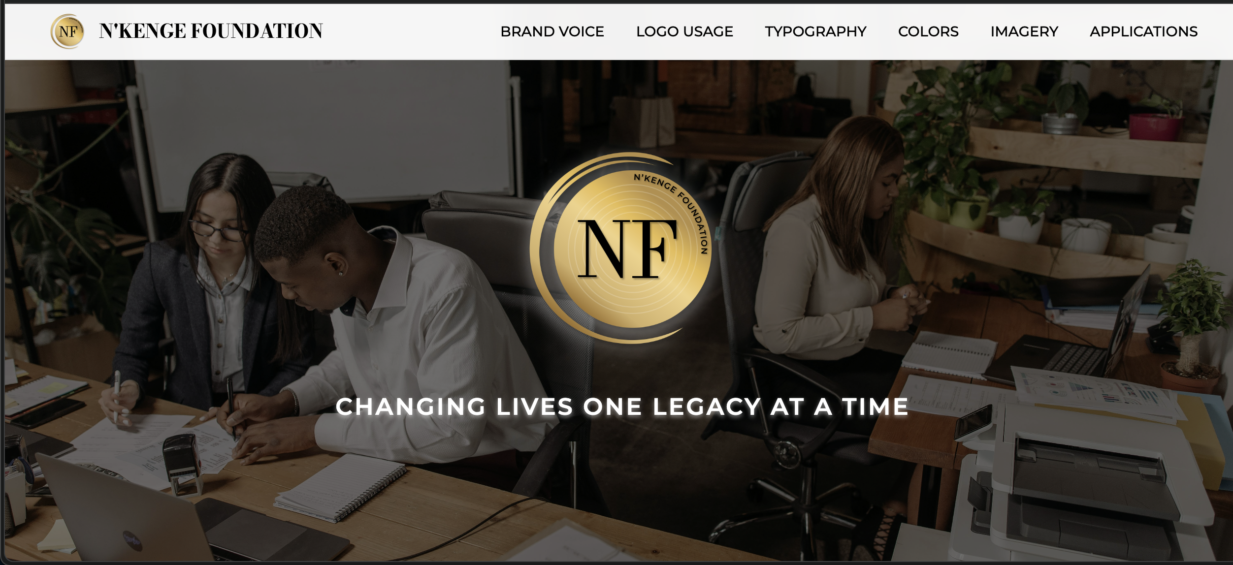
The original logo presented several usability challenges—it wasn’t optimized for digital applications, lacked clear variation guidelines, and didn’t translate well across different mediums. The foundation needed a complete brand system that could work seamlessly across presentations, websites, print materials, and event signage while maintaining visual consistency and professional credibility.
The most significant challenge was developing a color palette that felt both sophisticated and warm, professional yet approachable. The gold gradient system required extensive experimentation to achieve harmony between multiple gold tones that could work independently or together while maintaining accessibility standards.
The Solution
The brand identity system centers on a refined logo that maintains the foundation’s circular gold motif while improving usability across all applications. The redesigned mark features better proportions, clearer typography integration, and multiple variations optimized for different use cases—from dark backgrounds to watermark applications.
The typography hierarchy establishes clear visual relationships through a carefully selected font pairing. Bodoni Moda serves as the primary title font, used exclusively for the N’Kenge Foundation name and H1 applications, providing elegant sophistication. Montserrat handles all other text needs, from section headings in SemiBold and Medium weights to body text in Regular, ensuring both readability and brand consistency.
The gold gradient system represents the project’s most complex challenge and successful resolution. After extensive experimentation, I developed a five-tone gold palette ranging from light (#FFE699) to darkest (#8D5F1B), with each tone precisely calibrated for specific applications. This system works harmoniously whether used as individual colors or in gradient combinations, providing flexibility while maintaining visual cohesion.
The comprehensive brand guidelines ensure consistent application across all touchpoints, from detailed logo usage rules to imagery style guidance that celebrates authentic BIPOC artistic expression. The system includes specific applications for slide decks, business cards, letterhead, event signage, and digital interfaces.
Technical Implementation
The brand kit is deployed as a Cloudflare Worker application at nf-brand-kit.nyc.workers.dev, providing fast global access to brand resources and guidelines. The deployment showcases the complete visual system through an interactive format that serves both as a style guide and practical brand resource.
The color system includes complete specifications across multiple formats:
- Hex codes for digital applications
- RGB values for screen display
- CMYK values for print production
- Pantone approximations for professional printing
Typography specifications provide detailed usage guidelines, including font weights, sizing hierarchies, and application contexts, ensuring consistent implementation across all brand touchpoints.
Brand Applications & Impact
The brand system successfully addresses the foundation’s diverse communication needs through versatile applications. The slide deck templates provide professional presentation tools for donor meetings and board presentations. Event signage systems create cohesive visual experiences for showcases and community events. Digital applications, including website headers and social media assets, maintain brand consistency across online platforms.
The imagery style guide establishes clear direction for photography and visual content, emphasizing authentic representation of BIPOC artists and community engagement. This guidance ensures all visual communications align with the foundation’s values while maintaining professional standards.
The comprehensive brand identity positions the N’Kenge Foundation as a credible, professional organization worthy of significant partnerships and funding opportunities. The sophisticated visual system reflects the excellence of the artists they serve while remaining accessible and welcoming to diverse communities.
Results & Foundation for Growth
This branding project establishes a robust foundation for the N’Kenge Foundation’s continued growth and impact. The comprehensive brand guidelines ensure consistency as the organization expands its programs and partnerships. The versatile logo variations and color system accommodate future applications while maintaining brand integrity.
The professional brand identity opens doors to new partnership opportunities, grant applications, and community engagement initiatives. The visual system scales effectively from business cards to large-format event banners, supporting the foundation’s mission across all communication touchpoints.
Most importantly, the brand successfully captures the foundation’s core mission of amplifying BIPOC stories through the arts, creating a visual identity that honors both artistic excellence and community empowerment.
Technical Highlights
- Logo Redesign: Refined circular gold mark with improved proportions and multiple optimized variations
- Typography Hierarchy: Strategic font pairing with Bodoni Moda and Montserrat creating clear visual relationships
- Gold Gradient System: Five-tone palette with precise color specifications across digital and print applications
- Comprehensive Guidelines: Detailed usage rules, spacing requirements, and application contexts
- Cloudflare Worker Deployment: Fast global access to brand resources and interactive style guide
- Multi-Format Color Specs: Complete color system with Hex, RGB, CMYK, and Pantone specifications
- Versatile Applications: Brand system designed for presentations, print materials, digital platforms, and event signage
- Imagery Style Guide: Clear direction for photography and visual content supporting authentic BIPOC representation
The N’Kenge Foundation brand identity demonstrates how thoughtful design strategy can honor an organization’s mission while creating practical tools for growth and impact.